

- One strength I see in my work in my uniqueness. One weakness is the lack of texture in some photos.
2. I can improve my approach to this by being more focused on colors, and my photos being more clear.
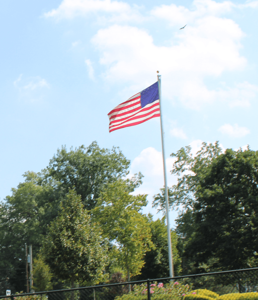
3. On the American Flag photo in the background there is an eagle. This eagles was the reason I took this photo since it is the animal of our country and it represents freedom.
4. I want to get more close up pictures because I feel like the close up photos focus more on texture
5. I want to experiment taking pictures of moving things to make it more challenging.
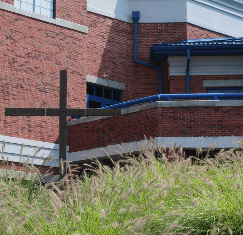
I think the color and texture are the best photos in the series. He made the color of the sign stand out very well and he made the texture feel implied. I think the man-made line photo could be better. The photo itself is blurry. HIS GEOMETRIC SHAPE PHOTO USES THE RULE OF THIRDS ON THE POINTS OF INTEREST ON THE CROSS AND THE BUILDING.
I think you did an amazing job. Maybe next time make sure the pictures are clean and maybe touch them up.